August 27, 2017Comments are off for this post.

Atomic Design

Word: Atomic Design

Definition: A methodology for creating design systems made up of atoms, molecules, organisms, templates, and pages.

Origin: Brad Frost put forward this new design system approach in his book Atomic Design.

Thoughts: Atomic design is used by product teams to keep everyone on the same page in order to create a consistent look, feel, and experience across a product. The idea is that all products are made out of atoms (buttons, links, headers, etc), then these atoms make up molecules (form inputs, search functions, etc), and finally, molecules make up complex organisms (page headers, modals, etc).

All you have to remember is that a design system is like a lego set and you're good to go!

August 27, 2017Comments are off for this post.

Readability and Legibility

Word: Readability and Legibility

Definition: Readability is the measure of complexity in the words and sentence structure of a piece of content. Legibility is the ability for people to see, distinguish, and recognize the characters and words within the text.

Thoughts: Not to be confused with "legibility", readability is about a reading level and the ability to parse and understand sentences at varying levels of complexity.

Legibility is not about the understanding of a sentence and instead, is concerned with whether someone is physically able to see and distinguish the text.

Reference: Both readability and legibility play into user experience. It is known throughout the UX community that users tend not to read most text on a page. Therefore, the text that is presented should be short, to the point, and easily understood at a quick glance. Fewer and less complicated words are important when designing a user experience for all audiences, particularly when the text is not the end goal for the user.

Legibility is equally important because you cannot have readability without legibility. This means that text on a page should be sized appropriately (or have larger options), contain strong contrast with page color and other page elements, and should be written in a clean, less decorative typeface.

Here's an example of good readability and legibility from the Slack homepage. The text is written in short concise sentences making it easy to understand and great for quick skimming. Additionally, the legibility is great because of the contrast between the font and background color. It is easy to distinguish the hierarchy of important based on size and weight.

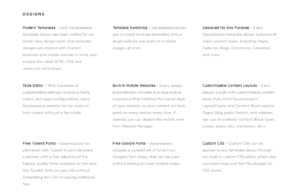
Now an example of the bad from SquareSpace's "Feature Index" page. The legibility is very difficult here. Notice the extremely low contrast between the font color and background -- not to mention the small font size. This is an example where designers chose visual aesthetics over usability and legibility. The readability is not great either because the amount of text and length of the sentences make it difficult to skim and understand quickly with ease.


August 25, 2017Comments are off for this post.

Touch Target

Word: Touch target

Definition: The UI element or object on a touch screen that a user is expected to interact with for the purpose of completing a task.

Thoughts: Target areas should not be taken lightly because usability should always be top of mind. Nothing is more frustrating for a user than a button she has to tap over and over again because it isn't responding to her touch.

Target areas should be large enough for a finger to tap it in one try. If you're unsure (and even if you're sure for that matter) here's some free advice... do some usability testing!

For an example of what not to do, let's take a look at the new iOS Podcasts app update. I don't know about you, but the play button is the most important element I need to access here. So I'd love to know what Apple designers were thinking when they put this TEENY TINY touch target in the bottom corner. I don't like to play hide and seek with my apps thank you very much.

This touch target is directly above the app navigation (across the bottom) as well. I can't tell you how many times I tapped the "unplayed" item instead of the play button. See the irony here? I wouldn't have any unplayed podcasts if I was actually able to tap the play button with ease! Sheesh! End rant.

August 25, 2017Comments are off for this post.

Roach Motel

Word: Roach motel

Definition: A wide-ranging group of "dark ux patterns" that describe user experience techniques in which users can easily get into a certain situation but then, intentionally, have a hard time getting out of the given situation once they realize it is undesirable.

Reference: I first came upon this term on DarkPatterns.org and it seemed like the absolute perfect way to describe the occasionally nefarious practices taken by certain designers when they are not transparent with their users.

Example: I'm sure you'd like an example so you know what all that grumbling above is about. Have you ever had an extremely difficult time unsubscribing from a subscription service? There always seems to be too many screens and check boxes that need vigorous attention before you can truly unsubscribe. I bet it only took one click for you to subscribe to the service! So why does opting out takes you down a rabbit hole of despair?

Just yesterday my boyfriend went to cancel his 14 day trial of the subscription book service, Scribd. Not only was the unsubscribe hard to find, but he had to sit through at least 5 screens asking if he was sure he wanted to leave. (For the record, he was 100% sure at the first screen). Even the Scribd help section lists the final step of this process as "'Select "Deactivate your account' on the bottom of the page and follow the onscreen prompts." Why are there even prompts at all?! This should not be a hard nor time consuming process.

There is something to be said for a company that practices dark UX patterns and assumptions can be made about how they value their users.

August 24, 2017Comments are off for this post.

Realism

Word: Realism

Definition: A design style that mimics physical items or textures for aesthetic appeal and effect.

Thoughts: While this might seem like a ridiculously easy term to define, it's actually important because realism is often confused with skeumorphism. Realism is used purely for stylistic reasons while skeumorphism is about using metaphors as affordances and supports in order to teach users how to interact with and understand an interface.

Examples: Below is an example to illustrate. Keep in mind how this design is focused on realistic aesthetics and textures that mimic the real world but the visual does not provide clues as to how you should interact with the UI.

For fun: If you've scrolled down this far you deserve a final prize! Check out this amazing website that pits Flat Design vs. Realism!

Realism and flat design represent extremely different visual design choices and you will find most people have a strong preference for one over the other.

August 24, 2017Comments are off for this post.

Framing Effect

Word: Framing effect

Definition: A form of cognitive bias, in which a person's reaction to a specific choice is different depending on the way in which the situation is presented.

Reference: Leaders in the study of behavioral economics, Amos Tversky and Daniel Kahneman, wrote a paper entitled "The Framing of Decisions and the Psychology of Choice" in 1981 to understand the psychological impact of framing effects.

The study asked the first group of participants if they would drive 20 minutes out of their way to buy a $15 calculator for $5 off. About 70% of participants said they would. For comparison, they asked a second group of participants if they would drive 20 minutes out of their way to save $5 on a $125 jacket. This time, only 29% said they would.

So what's the rationale behind this seeming irrationality? In the case of the calculator, the participant would be saving 33% off the original price, which feels like a great deal. On the flip side, she is only saving 4% when $5 is taken off the $125 coat and that just doesn't seem worth it.

It's all about the framing!

Thoughts: When creating a design that involves decision making, these are the types of psychological principles designers need to consider.

Remember to keep in mind that framing effects are closely tied to anchoring, both of which are extremely useful in e-commerce, particularly when it comes to price-setting.

August 23, 2017Comments are off for this post.

Skeleton Screens

Word: Skeleton Screens

Definition: A blank version of the page currently loading. Users generally see gray boxes where images will soon appear alongside gray lines denoting areas where text will load.

Thoughts: This is a common user experience technique is used as a page load distraction device. It is acommon alternative to the loading spinners, beachballs of death, and agonizing progress bars.

By displaying skeleton content, it gives the user the illusion that things are happening immediately. When the user sees something, anything, appear on screen, she tends to be less impatient knowing that her command has been heard and action is taking place.

Reference: I first came upon this term reading Luke Wroblewski's blog in reference to his mobile app Polar, which utilizes the technique.

Skeleton screens can be seen all over the web and on mobile. Pay attention next time you're waiting for a Medium article to load or you're opening up your LinkedIn app.

August 23, 2017Comments are off for this post.

Predictive Persona

Word: Predictive Persona

Definition: A research tool that allows you to validate whether you can accurately identify somebody who will become a customer. These types of personas go beyond merely describing what a user is like, but also offer specific characteristics that will make a person become a new or a returning customer.

Reference: I first learned of this term from designer Laura Klein in her blog post for Invision. Klein wants to turn the traditional "describe your current user" persona model on its head by changing the way designers think about this portrait. She writes: 

"But the question they should be asking themselves isn’t, 'If I interviewed a user, would this describe her?' The question should be, 'If I found a person like this, would she become a user?'"

Thoughts: The key to predictive personas is to identify traits and feature that will make a person want to become a customer. Once the persona is created, then designers can recruit research participants that fit this description. If you have a hard time doing this, something is wrong with your persona! Eureka!

It is always refreshing to try out a new take on an old research technique, so let's get predicting!

August 23, 2017Comments are off for this post.

Stakeholder Interview

Word: Stakeholder Interview

Definition: A structured conversation between designers and important clients used to gather insights into a project and better understand the business goals and expectations.

Thoughts: Stakeholders can take the form of senior leadership with the financial stake and they can also be end users. Essentially, stakeholders are anyone who can affect the end product.

Clients or product owners do not always provide all the information a designer needs to fully understand a project. Enter, stakeholder interviews. These interviews provide a deeper understanding of your client's needs and they also give design teams early clues into where there might be conflict between business goals and user requirements.

Tips: It is best to go into a stakeholder meeting prepared. Have questions written down and remember to take notes! Keep it conversation but have a carefully planned agenda.