September 20, 2017Comments are off for this post.

Open-Ended Questions

Word: Open-ended questions

Definition: An open-ended question does not have a right or wrong answer. It doesn't even have pre-determined ideas for what the answer might be. Such questions cannot be satisfied with a simple yes or no.

Thoughts: I know this seems like a simple word to define but it is so important to understand the art of question-asking when conducting user interviews. An open-ended question provides room for discoverability and this is where the heart of UX problem- solving lives! The more open-ended and vague your question is, the more room you give your user to dig deeply and thoughtfully. Don't be afraid of silence either. Users may shy away from open-ended questions by giving an insufficient answer. When this happens, let the silence linger, and the user will likely expound on her answer to fill the awkward moment. Once the silence is filled, you will be glad your question gave room for this opportunity.

September 14, 2017Comments are off for this post.

Primary Navigation

Word: Primary Navigation

Definition: Directing links on a website or application that (most typically) appear above the fold, are displayed near the top of the page, and represent the content that is most relevant to the user.

Thoughts: Primary navigation can usually be found at the very top of a page and is always displayed prominently. Navigation is key to way-finding and acts as a constant and comforting presence to orient the user.

Question: Is primary navigation a left-over relic of internet-past? What will be the role of primary navigation on our infinite and parallax scrolling future?

September 14, 2017Comments are off for this post.

Breadcrumbs

Word: Breadcrumbs

Definition: A type of secondary navigation used for wayfinding, orientation, and location within an application or website. Breadcrumbs prove to be especially helpful when landing on a page out of context or not arriving initially through a homepage.

Thought: Breadcrumbs are seen and used most often on large-scale website full of copious amounts of information, like e-commerce sites. This navigational is growing increasingly important because fewer people enter a website through the front door (i.e. the home page or landing page). In the age of powerful search engines, your user will likely come in through the back. It's very important that when your user arrives, she can orient herself immediately.

September 14, 2017Comments are off for this post.

User Journey Map

Word: User Journey Map

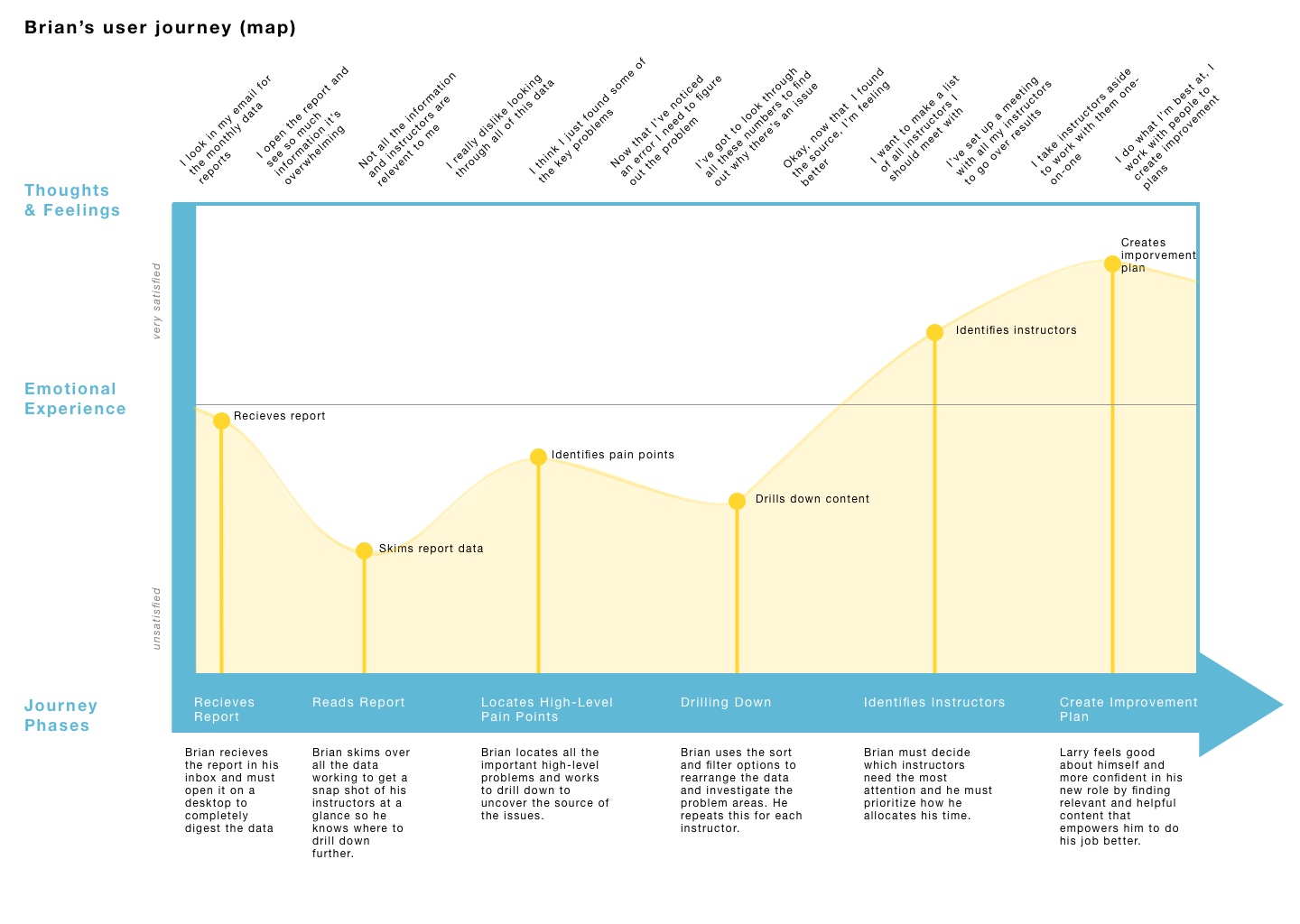
Definition: A map or diagram that illustrates the story of how a user experiences and interacts with a product or company. The story can be a small portion of the experience or an all-encompassing overview in order to provide insights into the user's thoughts, feelings, and motivations.

Thought: User journeys are helpful to many people within a company, but the key takeaways for UX practitioners include uncovering pain points, understanding the user's unique perspective, and providing insight into user's decision making.

There is no formula for a user journey map. They can take any format you like, so long as it is simple and readable. This could be a timeline, an infographic, or a storyboard - just to name a few.

Word of warning, user journeys should be created from research and gathered information from users. This is not a free-form art class. No one is interested in your thoughts or feelings here.

Below is an example of one that I did a while back for reference. Don't judge it too harshly.

Question: Are we at a point yet where this tool is universally accepted by teams outside of design or, are UXers still barring the heavy-lift in selling the importance of these documents to stakeholders?

September 13, 2017Comments are off for this post.

Gamification

Word: Gamification

Definition: The use of game elements and design features in a non-gaming context in order to solve problems, like in a business, for example.

Thought: Three strong components of gamification that have spread rapidly through the digital design industry are validation, completion, and prizes.alidation is like retweets, up-votes, and likes.

Validation drives engagement and strengthens the sense of community.

Completion, just like working your way through a game level, can be applied to anything from your Linkedin profile percentage to hitting a step-count on a fitness tracker.

Prizes are used as incentives to focus the user and help her see a task through to completion. A great example is earning badges and avatars on the language learning application, Duolingo.

Question: While these are just three examples, it is easy to see how gamification has infiltrated our digital lives. Now that gamification is all around us, will this diminish its powerful effect? Have we already over-used this technique to a point-of-no-return?

September 13, 2017Comments are off for this post.

Feature Creep

Word: Feature Creep

Definition: The ongoing addition of new features to a product that tends to result in over-complication and loss of initial focus and purpose.

Thought: </strong> Feature creep is the exact reason why it\'s important to identify an MVP (Most Viable Product) and stick with it. This is the time to excise self-control. Pick your most important features to build out, and then build only those. As soon as you start introducing new and unnecessary additions, your product will lose its focus which can be disastrous. That is my PSA so please know, you have been warned.

Question: Can you think of a great but simple product that was ruined by feature creep?

September 12, 2017Comments are off for this post.

Paper Prototyping

Word: Paper Prototyping

Definition: The technique of creating hand-drawn interfaces in order to quickly ideate, simulate, and test early design concepts.

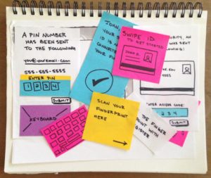
Reference: It's literally as simple as a pencil and paper (and some multi-colored post-it notes if you're feeling very adventurous.) A paper is great for tight budgets, fast iterations, and easy documentation.

Some designers believe that paper is not a reliable testing tool and that users will not take the "arts and crafts" look seriously. I would argue that because there is nothing precious about a paper-prototype and users will be more open and inclined to offer true thoughts and opinions. Look for an example below by yours truly. 😉

Thoughts/Questions: Paper-prototyping is changing with the times and can now be incorporated into more robust applications, such as POP (an app that takes photos of drawings and allows you to link up hot spots to simulate physical clicking and tapping). Do you think prototyping tools like this, which are created to enhance the simplistic and raw experience of paper-prototyping, elevate the gritty research technique or does it adversely affect the underlying nature of it?

September 12, 2017Comments are off for this post.

Door-in-the-face

Word: Door-in-the-face

Definition: The notion that refusing a large request (figuratively getting the door slammed in your face) increases the likelihood of agreeing to a second, smaller request, shortly thereafter.

Reference:  A compliance method from social psychology, this technique works because of the principle of reciprocity (Cialdini et al, 1975). Saying "no" to a large request creates a feeling of guilt towards the asker, and in turn, the person being asked now feels as if she owes something. This manipulation strategy is often used in marketing.

The concept plays into design strategy when dealing with subscription fees or add-on purchases, for example. Think about a time when you bought an online subscription. There are often multiple packages to choose from. Once you've looked over the choices and decided the expensive option is outrageous, you are more inclined to see the less expensive option as more reasonable in comparison. Hence, your guilty conscience may lead you to buy yet another unwanted and unneeded steaming music service!

Thoughts/Questions: As a user experience designer, where does your job end and the marketing department's job begin? Should a line be drawn between marketing tactics and what's best for the user?

September 12, 2017Comments are off for this post.

Skeuomorphic Design

Word: Skeuomorphic Design

Definition: The design style in which old and familiar ideas are incorporated into new technologies even if the familiar no longer plays a functional role. In other words, the digital is made to look like the old (in this case, the physical world) it represents.

Reference: Think of the early Apple iOS design in which the "Notepad" app physically looked like a ruler-lined notebook. Or my personal favorite, the first Southwest Airlines site that was designed to look and function just like the real world ticket counter. (Oh, how far we have come in the world of airline websites.

Thoughts: We have long moved passed the "amateur" skeuomorphism of the internet past and into the world full of flat and material design. Like fashion, I still wonder if we ever see the day when skeuomorphism is so old, it's new again?

September 7, 2017Comments are off for this post.

Hick’s Law

Word:  Hick's Law

Definition: The time it takes for a person to make a decision increases with the number of choices available.

Reference: The law is named for British psychologist William Edmund Hick. Countless studies in fields from psychology to marketing have investigated the effect of options on decision making and satisfaction (I suggest the jam study if you're looking for a good example). Widespread consensus shows that not only do fewer choices decrease the time of decision making (a la Mr. Hick) but it also generates greater user satisfaction. The fewer the choices, the more satisfied the user is with her final decision. Seems counter intuitive, but science doesn't lie, my friend.

Thoughts: While it is simple to see how Hick's Law is used in web design to justify menu and navigation decisions, you would be limiting yourself greatly if that is the only design feature influenced by this principle. If you dig more deeply, you will see that decisions are the crux of experiences and impact every move and click a user takes.