All Posts in terms

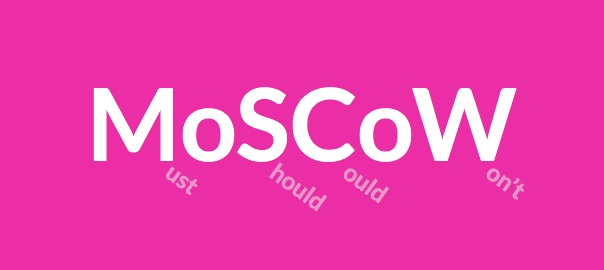
January 24, 2015 - Comments Off on MoSCoW Method

MoSCoW Method

Word:  MoSCoW Method

Definition: The acronym is a method that helps understand and prioritize features of a product in order to define project needs and scope.

Thoughts: The letters in the acronym stand for: Must have (minimum viable product), Should have, Could have, and Won't have (at least for now, but can be added in the future).

The MoSCoW method is a great tool for brainstorming while also understanding the depth and limitations of your product. "Moscow-ing" with post-its on a white board is my preferred practice of the method and I highly recommend it!

Questions: What are other great, and visual ways, of feature prioritization?

January 23, 2015 - Comments Off on The Fold

The Fold

Word:  The Fold

Definition: A theoretical line, below which content on a website or application is not visible without scrolling.

Reference: The fold is a term borrowed from print, back when it truly referred to the literal fold in the center of a newspaper page. Newspaper editors wanted to make sure that their most eye-catching and important headlines appeared "above the fold" so that the content was visible when papers were stacked for display and purchase.

The digital equivalent is content that appears when a web page loads. The content that fits the screen before scrolling is said to be "above the fold".

Here's the debate, because let's face it, there is always a debate - many say that "the fold" is no longer a relevant way to view and layout content in an era when scrolling has become a norm and a reflex. Design studio, Huge Inc, did a wonderful UX research investigation on just this and it is definitely worth checking out. In their study, Huge found that nearly everyone scrolled past the fold but it was various affordances that determined how far down the page the user explored.

Thoughts/Questions: Your turn! As we talk today, in 2015, is "the fold" still a relevant way of thinking about UX design?

January 22, 2015 - Comments Off on Guerrilla Testing

Guerrilla Testing

Word:  Guerilla Testing

Definition: Guerrilla testing is summed up perfectly by designer Martin Belam, who describes the technique as “the art of pouncing on lone people in cafes and public spaces, [then] quickly filming them whilst they use a website for a couple of minutes.”

Thoughts: Guerrilla research has proven to be a cheap and efficient form of usability testing. Instead of recruiting participants, researchers bring prototypes to coffee shops or public areas and use compensation (like a small gift card) to incentivize strangers into testing their products for a few minutes.

While the technique definitely has its benefits, especially for cost and time, it is not the perfect solution in all cases. In order for this method of testing to be effective, for example, the product must not target a specific or niche user base because a random sample of people will not be representative of your end users.

Questions: Laura Klein recently wrote an article entitled "Stop Accosting People in Coffee Shops" in which she details the many ways that guerrilla testing is an insufficient form of research in many cases. How often to do you practice guerrilla testing? Are you using it properly or as an easy way out?

January 21, 2015 - Comments Off on Search Dominant Users

Search Dominant Users

Word:  Search-Dominant Users

Definition: The tendency of a user to go straight for the search bar when first entering a site looking for content.

Reference: Jakob Nielsen sheds light on search-dominant users in his 1999 book, Designing Web Usability and notes, that over half of users exhibited "search-dominant" tendencies. However, Nielsen's assertion was later tested in later research studies including Jared Spool's study in which he found no "search-dominant" users, and instead, found only "search-dominant" sites.

Thoughts and Questions: While a debate still remains, it is important to understand the power of search and take careful consideration when designing a user interface. Whether the user is search-dominant or you created a site that promotes search-dominant behavior, you better believe that users will be searching for that search!

January 20, 2015 - Comments Off on Secondary Navigation

Secondary Navigation

Word: Secondary Navigation

Definition: Directing links on a website or application that represents information that is of secondary interest to the user.

Thoughts: Great examples of secondary navigation are pages that sites feel obligated to offer such as "FAQ" and "About Us". This is not to downplay the importance of such links, which are helpful in their moments, but for the most part, a user has not arrived on your site just to read your "About Us" section. Larger websites like your Home Depots or your Amazons need these tiered navigational schema because of the plethora of  navigational choices. Regardless of site size, tread lightly and choose your navigations thoughtfully and purposefully.

Question: If secondary information is so secondary, does it even belong at the top of the page (the typical location)? Is the footer more appropriate? If the footer, is it still considered secondary navigation?

January 19, 2015 - Comments Off on Primary Navigation

Primary Navigation

Word: Primary Navigation

Definition: Directing links on a website or application that (most typically) appear above the fold,  are displayed near the top of the page, and represents the content that is most relevant to the user.

Thoughts: Primary navigation can usually be found just below the logo and header and is always displayed prominently. Navigation is key to way-finding and acts as a constant and comforting presence to orient the user.

Question: Is primary navigation a left-over relic of interets-past? What will be the role of primary navigation on our infinite and parallax scrolling future?

January 18, 2015 - Comments Off on Breadcrumbs

Breadcrumbs

Definition: A type of secondary navigation used for way-finding in order to reveal the user's location within a website or application. Breadcrumbs prove to be especially helpful when landing on a page out of context or not arriving initially through a homepage.Screen Shot 2015-01-17 at 11.47.21 PM

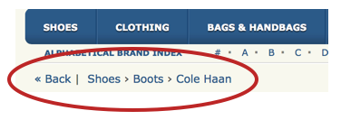
Thought: Breadcrumbs are seen and used most often on large websites full of copious amounts of information, like e-commerce sites. However, it seems that the trend for breadcrumbs may be fading fast and the pattern is not as strong or significant as it was, say, three years ago.

It is important to keep an eye out for such trends because, like in any other constantly and evolving field, patterns go in and out of style. I mentioned it here because it is an important term to know and understand when discussing way-finding and navigational context even if the pattern may not be as widely used.

Question: What do you think; are breadcrumbs still an impactful and/or a relevant UI pattern?

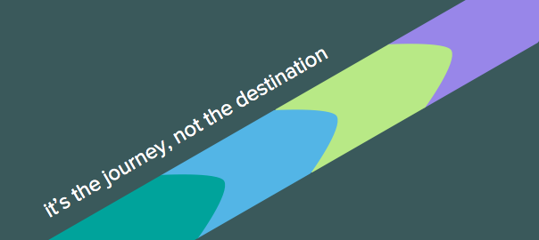
January 17, 2015 - Comments Off on User Journey

User Journey

Word:  User Journey

Definition: A map or diagram that illustrates the story of how a user experiences and interacts with a product or company. The story can be a small portion of the experience or an all-encompassing overview in order to provide insights into the user's thoughts, feelings, and motivations.

Thought:  User journeys are helpful to many people within a company, but the key takeaways for UX practitioners include uncovering pain points, understanding the user's unique perspective, and providing insight into user's decision making.

There is no formula for a user journey map. They can take any format you like, so long as it is simple and readable. This could be a timeline, an infographic, or a storyboard.

Word of warning, user journeys should be created from research and gathered information from users. This is not a free-form art class. No one is interested in your thoughts or speculations here.

Below is an example of one that I did a while back if you need an example

journey-touch

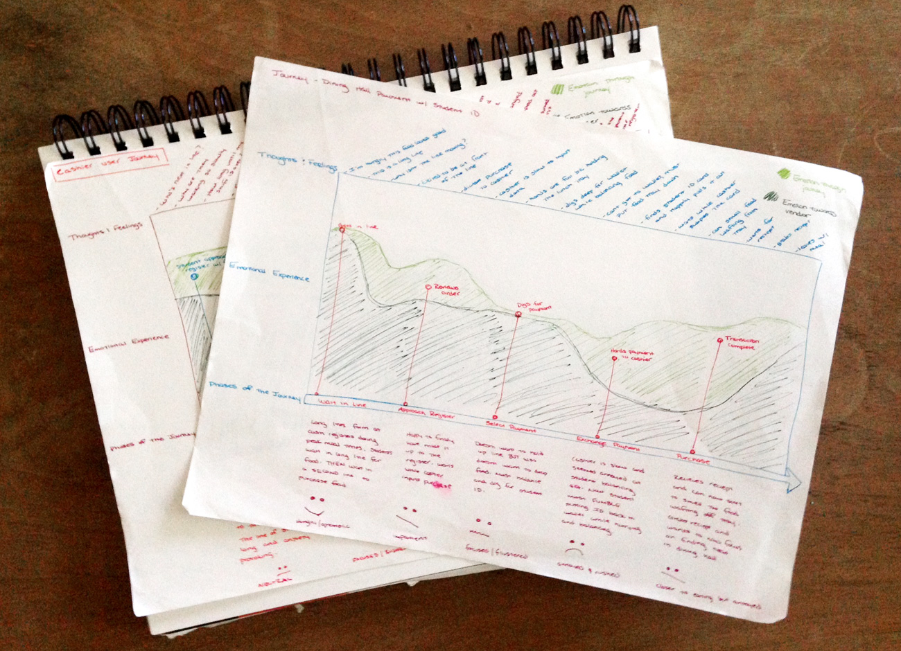
Question: Are we at a point yet where this tool is universally accepted by teams outside of design or, are UXers still barring the heavy-lift in selling the importance of these documents to stakeholders?

January 16, 2015 - Comments Off on Gamification

Gamification

Word:  Gamification

Definition: The use of game elements and design features in a non-gaming context in order to solve problems, like in a business for example.

Thought:  Three strong components of gamification that have spread rapidly through the digital design industry are validation, completion, and prizes.

Validation is like retweets, up-votes, and likes. Validation drives engagement and strengthens the sense of community.

Completion, just like working your way through a game level, can be seen applied to anything from your Linkedin profile percentage to hitting a step-count on a fitness tracker.

Prizes are used as incentives to focus the user and help her see a task through to completion. A great example is earning badges and avatars on the language learning application Duolingo.

Question: While these are just three examples, it is easy to see how gamification has infiltrated our digital lives. Now that gamification is all around us, will this diminish its powerful effect? Have we already over-used this technique to a point-of-no-return?

January 14, 2015 - Comments Off on Paper Prototyping

Paper Prototyping

Word:  Paper Prototyping

Definition: The technique of creating hand-drawn interfaces in order to quickly ideate, simulate, and test early design concepts.

Reference: It's literally as simple as a pencil and paper (and some multicolored post-it notes if you're feeling very adventurous.) Paper is great for tight budgets, fast iterations, and easy documentation. Some people believe that paper is not a reliable testing tool and that users will not take the "arts and crafts" look seriously. I would argue that because there is nothing precious about a dirty paper-prototype, users will be more open and inclined to offer true thoughts and opinions. Look for an example below by yours truly!

IMG_2977

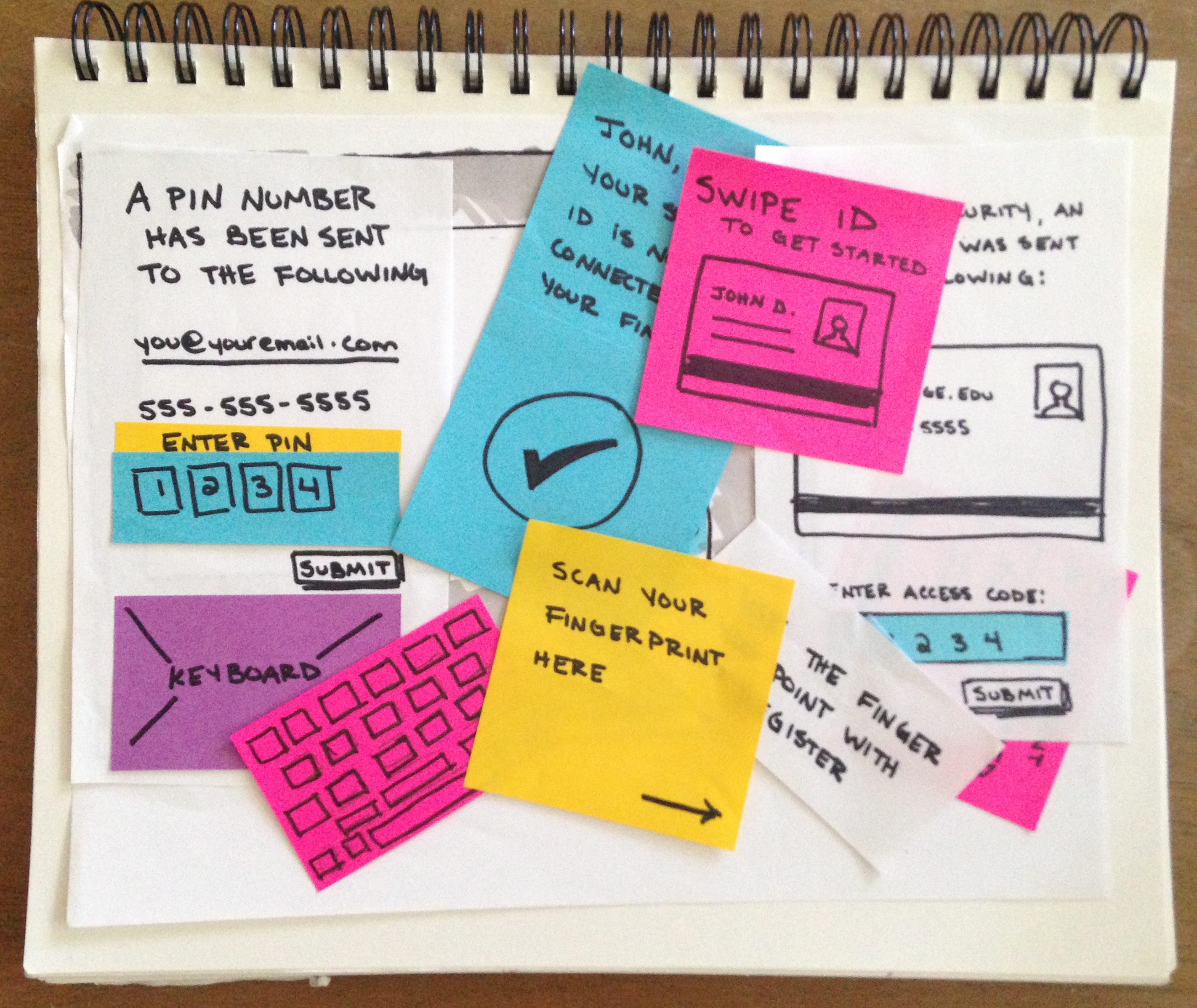
Thoughts/Questions: Paper-prototyping is changing with the times and can now be incorporated into more robust applications, such as POP (takes photos of drawings and allows you to link up hot spots to simulate physical clicking and tapping). Do you think prototyping tools like this, which are created to enhance the simplistic and raw experience of paper-prototyping, elevate the gritty research technique or does it adversely affect the underlying nature of it?