Results for "affordance"

January 2, 2015 - Comments Off on Affordance

Affordance

Word:  Affordance

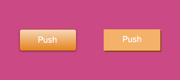
Definition: The properties of an object that determine what actions are possible. For sake of an every day example (no pun intended, Mr. Norman), a hinged door affords pushing or pulling.

Reference: The term was originally invented by the psychologist J. J. Gibson to refer to physical possibilities by properties of an object and was famously (in our design world bubble at least) articulated by Don Norman in his game changing book "The Design of Everyday Things." Norman thoughtfully writes, "An affordance is a relationship between the properties of an object  and the capabilities of the agent that determine just how that object could possibly be used."

Thoughts/Questions: Take note, affordances are all around you! But don't get this confused with signifiers (more on those tomorrow).

October 5, 2015 - Comments Off on Realism

Realism

Word: Realism

Definition: A design style that mimics physical items or textures for aesthetic appeal and effect.

Thoughts: While this might seem like a ridiculously easy term for me to be defining, it's actually important because realism is often confused with skeumorphism. Realism is used purely for stylistic reasons while skeumorphism is about using metaphors as affordances and supports in order to teach users how to interact with and understand an interface.

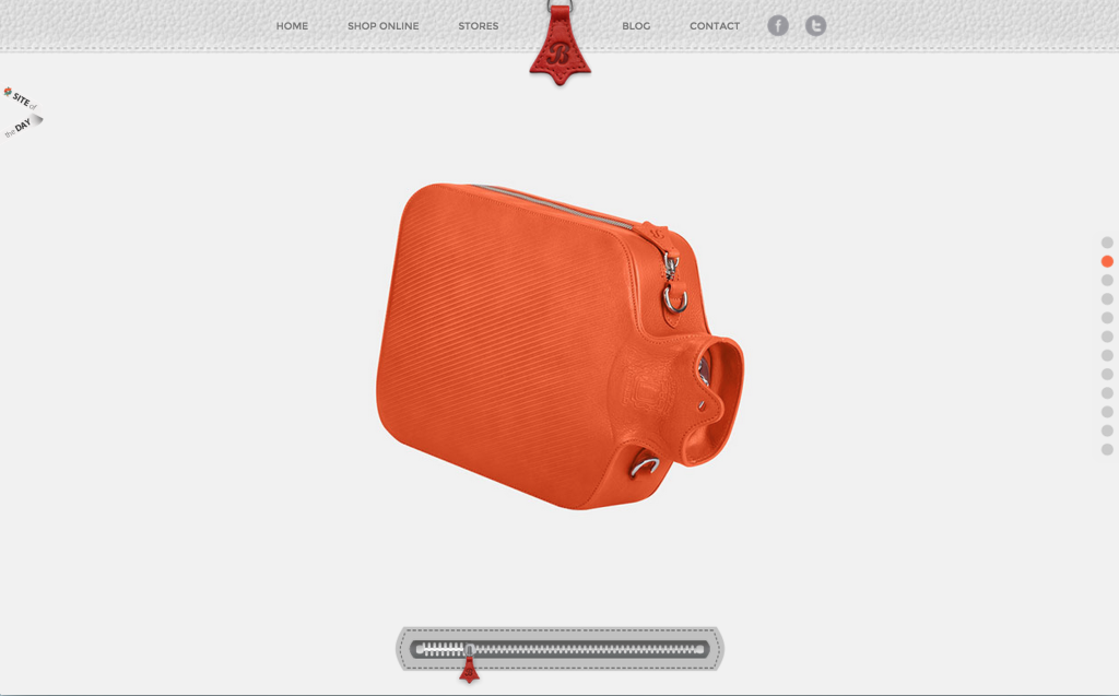
Examples: Below are a couple examples to illustrate. Keep in mind how these designs are focused on realistic aesthetics and textures that mimic the real world but the visual does not provide clues as to how you should interact with the UI.

Screen Shot 2015-10-05 at 6.08.48 PM

Screen Shot 2015-10-05 at 6.08.25 PM

For fun: If you've scrolled down this far you deserve a final prize! Check out this amazing website that pits Flat Design vs. Realism!

Realism and flat design represent extremely different visual design choices and you will find most people have a strong preference for one over the other.

February 18, 2015 - Comments Off on Fat Footer

Fat Footer

Word: Fat footer

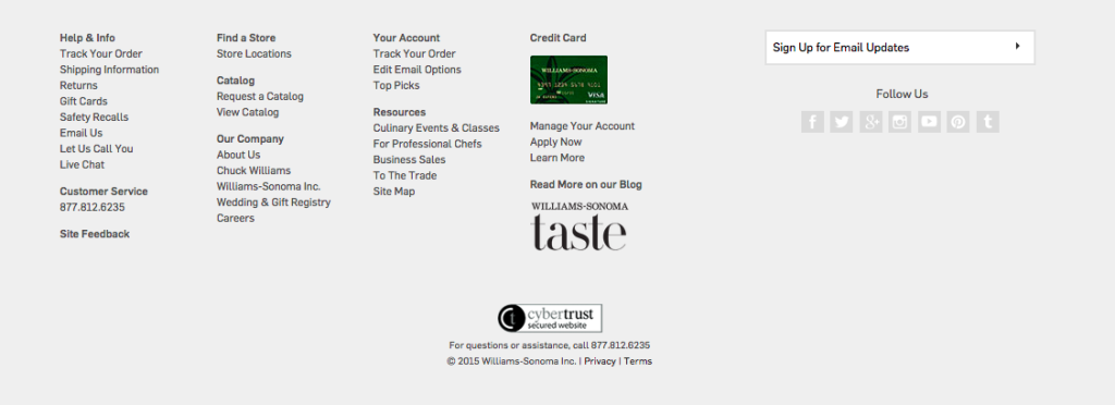
Definition: A form of secondary navigation located at the bottom of the page, typically taking up a considerable amount of page real-estate and serving as a shortcut to hierarchical content.


Screen Shot 2015-02-18 at 9.24.37 PM

Williams-Sonoma fat footer


Thoughts: Fat footers are typically used on sites with an incredible amount of information and lengthier page content. These sections are extremely helpful to link popular site content that may not be directly relevant to the selected page itself. It also acts as a visual anchor and an affordance that a page has come to an end while providing additional page view opportunities. Fat footers also present space for graphics, social media links, and newsletter promotions. These big guys have graduated from more than just links lists.

While I know this may come off as a broken record to you consistent "UX 365" readers, but there is a debate on this topic amongst us! While there are clear benefits to such "obese footers" (as Jakob Nielsen once called them), there are also thoughts of too many links and a persistent feeling of "spamminess".

Both points are well taken and I venture to guess that like with most polarizing topics, it comes down to a case by case basis with specific business goals in mind.

Question: How does the persistence of continuous scroll effect the future of the footer, regardless of its size?

January 23, 2015 - Comments Off on The Fold

The Fold

Word:  The Fold

Definition: A theoretical line, below which content on a website or application is not visible without scrolling.

Reference: The fold is a term borrowed from print, back when it truly referred to the literal fold in the center of a newspaper page. Newspaper editors wanted to make sure that their most eye-catching and important headlines appeared "above the fold" so that the content was visible when papers were stacked for display and purchase.

The digital equivalent is content that appears when a web page loads. The content that fits the screen before scrolling is said to be "above the fold".

Here's the debate, because let's face it, there is always a debate - many say that "the fold" is no longer a relevant way to view and layout content in an era when scrolling has become a norm and a reflex. Design studio, Huge Inc, did a wonderful UX research investigation on just this and it is definitely worth checking out. In their study, Huge found that nearly everyone scrolled past the fold but it was various affordances that determined how far down the page the user explored.

Thoughts/Questions: Your turn! As we talk today, in 2015, is "the fold" still a relevant way of thinking about UX design?

January 3, 2015 - Comments Off on Signifier

Signifier

Word: Signifier

Definition: A signal that communicates appropriate behavior to a person and where an action should take place.

Reference: Don Norman explains the subtle difference between signifiers and affordances in his book, "The Design of Everyday Things." He amended the book in later editions because while the design community took fondly to the term affordance, Norman believed it was being improperly used (based on his definition).

Thoughts/Questions: Touch screens afford touching... but as to where and how to touch, this is a signifier.

How do you use "affordance" and "signifier"? Should the terms be defined by Norman himself, or should it take the meaning that the larger community as a whole has assigned?