All Posts in product management

February 11, 2015 - Comments Off on Minimum Viable Product (MVP)

Minimum Viable Product (MVP)

Word: Minimum Viable Product (MVP)

Definition: The smallest experiment that either proves or disproves assumptions about a business idea.

Thought: The MVP it is commonly misunderstand to mean the minimum feature set needed to create a working product. In that case, it might be better to use the MoSCoW Method instead which is created to facilitate feature prioritization.

Reference: The term minimum viable product was coined by SyncDev CEO Frank Robinson and later popularized by IMVU founder Eric Ries. For a deeper look on this topic the article "Putting the VP into MVP" on UX Booth is a great place to start.

February 9, 2015 - Comments Off on Ockham’s Razor

Ockham’s Razor

Word: Ockham's Razor (sometimes Occam's Razor)

Definition: A philosophical rule about simplicity. The theory states that when choosing between multiple options, the simpler choice should be selected.

Reference: The theory is named for 14th-century theologian, William of Ockham and is used as a problem solving device.

Ockham's Razor helps justify and support design decisions. Jason Fried and David Heinemeier Hanson, the duo behind such software as Basecamp, utilize this principle in their work. They have been quoted saying,

"We design [our applications] to be simple because we believe most software is too complex: too many features, too many buttons, too much confusion."

While a simplistic feature set is not the solution to all design problems, it does not hurt to keep Ockham's razor in the back of your mind, especially when determining a feature set and product scope.

Question: How do you feel about simplistic design and utilizing such theories in UX practice? Where are the exceptions? What are the pitfalls?

February 5, 2015 - 1 comment.

Information Architecture

Word: Information Architecture

Definition: "The art and science of organizing and labeling web sites, intranets, online communities and software to support usability and findability." - As defined by the Information Architecture Institute

Reference: Information architecture is performed by a variety of practitioners from specialized information architects themselves to more general UX researchers or even more broadly yet, UX/UI designers. However, and quite obviously, the disciplinary practice pulls from a variety of other subjects including library science, cognitive psychology, semiotics, cybernetics, discrete mathematics, and yes, even architecture. Information organization is not something that a UX designer should take lightly. Findability is an incredible component of what makes user experience so credible and invaluable to products, companies, and especially users.

Question:  It is easy to see how an information architect is extremely important when organizing a site with a plethora of information (think of the nightmare it was to do Amazon's IA). Is there ever a point when a site is too small for IA or IA does not need to be considered?

February 4, 2015 - Comments Off on Conversion Rate

Conversion Rate

Word: Conversion Rate

Definition: The percentage of users who take a desired action.

Thought: A frequently used example of conversion rate when it comes to UX is e-commerce. This would be the percentage of website visitors who buy something on the site. The Neilson Norman Group sums up the power of UX perfectly by stating, "Increased conversion is one of the strongest ROI arguments for better user experience and more user research."

Conversion rate is an important and qualitative way to measure performance over time and put an understandable and quantifiable statistic on the influence of UX practices. There is power in numbers, and strength in research. But remember, with great power comes great responsibility.

Question:  While e-commerce is the typical example of conversion rate, what other types of interactions are easily and effectively measured with this?

January 30, 2015 - Comments Off on Contextual Inquiry

Contextual Inquiry

Word:  Contextual Inquiry

Definition: A research approach in which the researcher physically goes on-site to meet with participants. Once on-site, the researcher can interview and/or observe users in their normal working environments.

Thoughts: Contextual inquiry, like everything in life, has its benefits and pitfalls. Let's start with the good! Observing a user in their "natural habitat" will provide much richer and detailed information that may be extremely hard or even impossible to learn over the phone or in a constructed setting. Think about designing hospital enterprise software, for example. If you can watch how staff work together and you can observe their workflow first hand, this will be far more beneficial than having someone dictate process to you over the phone.

In a perfect world, most of us would prefer this method above all else. However, such research techniques are first and foremost time-consuming and expensive. As we all know, research tends to be one of the first areas to get cut from budget, so many times this is just not an option. Additionally, there are security, intellectual property, and intrusiveness concerns on top of everything else.

We could all use an opportunity to get off our tails and when such an approach makes sense, jump at the chance. Keep contextual inquiry in your research arsenal!

Questions: Have you ever been in a situation when a contextual inquiry did not go as planned? How about a time you learned something during a contextual inquiry that might never have come up otherwise?

January 29, 2015 - Comments Off on Agile Approach

Agile Approach

Word:  Agile approach

Definition: A flexible design process which allows for more steps to happen alongside one another. This fluid approach lends itself to more rapid and flexible iteration.

Thoughts: Many teams choose an agile approach to design process over a waterfall approach because every step of the process is not treated as a separate distinct phase. Instead, teams are encouraged to work together from start to finish and are allowed the flexibility to research and iterate throughout the process. Waterfalls may be pretty and all, but they only go one direction! UX is all about improving and iterating as more information becomes available, so don't ever let me hear you say "I'm all done."

Questions: If we are being realistic, agile approaches do not work in all situations and environments for a multitude of reasons. Is there a good "in-between" compromise approach?

January 28, 2015 - 1 comment.

Waterfall Approach

Word:  Waterfall approach

Definition: A sequential design process that involves treating the steps of a project as separate, distinct phases, where approval of one phase is needed before the next phase can begin.

Thoughts: In this development approach the design phase does not typically begin until all requirements are approved by business stakeholders. However, a pure waterfall approach is not usually the best approach for UX work because it does not leave much wiggle room for any changes or iterations along the way. Each step is seen, for the most part, as final and completed. Think assembly-line style. The strict nature of this approach leads most designers and developers to work together in an agile approach instead (more on agile tomorrow).

Questions: What's an example of a project that would lend itself to a waterfall approach?


waterfall chart credit

January 26, 2015 - 2 comments

UX Unicorn

Word:  UX Unicorn

Definition: A UX professional who is considered a jack-of-all-trades because she has advanced knowledge in an enormous range of skills. These skills include but are not limited to, research, rapid prototyping, front-end development, user testing, graphic design, marketing, and branding.

Reference: There are two differing theories when it comes to these mythical designers. Some believe that UX unicorns do not exist. The idea that someone can be a master of all trades is preposterous and these beings only exist in the minds of hiring managers who want an all-for-one deal. Essentially, jack of all trades, master of none.

Then there is the other camp, that believe UX unicorns truly exist and that they not only walk among us, but that you can be one too! Essentially, work hard, put in the effort, and learn on the job. Only you hold yourself back from becoming a unicorn.

Question: Do you believe in UX unicorns? Are they good for our industry?


unicorn gfx credit

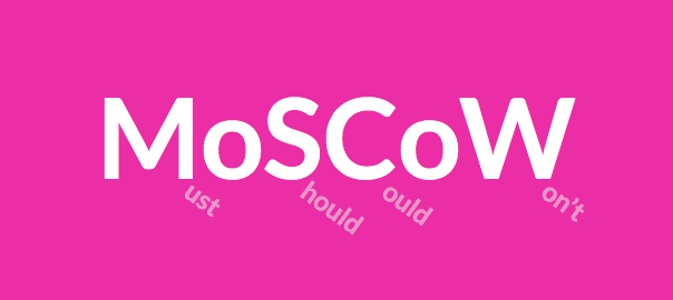
January 24, 2015 - Comments Off on MoSCoW Method

MoSCoW Method

Word:  MoSCoW Method

Definition: The acronym is a method that helps understand and prioritize features of a product in order to define project needs and scope.

Thoughts: The letters in the acronym stand for: Must have (minimum viable product), Should have, Could have, and Won't have (at least for now, but can be added in the future).

The MoSCoW method is a great tool for brainstorming while also understanding the depth and limitations of your product. "Moscow-ing" with post-its on a white board is my preferred practice of the method and I highly recommend it!

Questions: What are other great, and visual ways, of feature prioritization?

January 23, 2015 - Comments Off on The Fold

The Fold

Word:  The Fold

Definition: A theoretical line, below which content on a website or application is not visible without scrolling.

Reference: The fold is a term borrowed from print, back when it truly referred to the literal fold in the center of a newspaper page. Newspaper editors wanted to make sure that their most eye-catching and important headlines appeared "above the fold" so that the content was visible when papers were stacked for display and purchase.

The digital equivalent is content that appears when a web page loads. The content that fits the screen before scrolling is said to be "above the fold".

Here's the debate, because let's face it, there is always a debate - many say that "the fold" is no longer a relevant way to view and layout content in an era when scrolling has become a norm and a reflex. Design studio, Huge Inc, did a wonderful UX research investigation on just this and it is definitely worth checking out. In their study, Huge found that nearly everyone scrolled past the fold but it was various affordances that determined how far down the page the user explored.

Thoughts/Questions: Your turn! As we talk today, in 2015, is "the fold" still a relevant way of thinking about UX design?