February 10, 2015 - Comments Off on Kerning

Kerning

Word: Kerning

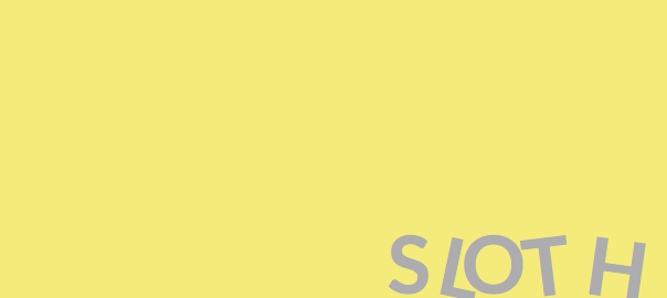
Definition: The adjustment of the space between characters in a font, typically done for visual appeal or effect.

Thought: While UX is not formally a visual design profession, it is still important for user experience designers to understand aspects of the visual and how it can influence user emotions. The kerning of a word can actually change the way that a word feels. Practice your kerning skills in a fun way with the "Kerning Game". Seriously, it's fun! But I'm warning you now, it is also addictive!

But wait, the fun does not stop there!  While not kerning per se, check out designer Ji Lee's "Word As Image" project to see some of the amazing things that can be done with just typography. It is also so cool that I just wanted an excuse to share it!

Question: How well did you do on the Kerning Game?

February 9, 2015 - Comments Off on Ockham’s Razor

Ockham’s Razor

Word: Ockham's Razor (sometimes Occam's Razor)

Definition: A philosophical rule about simplicity. The theory states that when choosing between multiple options, the simpler choice should be selected.

Reference: The theory is named for 14th-century theologian, William of Ockham and is used as a problem solving device.

Ockham's Razor helps justify and support design decisions. Jason Fried and David Heinemeier Hanson, the duo behind such software as Basecamp, utilize this principle in their work. They have been quoted saying,

"We design [our applications] to be simple because we believe most software is too complex: too many features, too many buttons, too much confusion."

While a simplistic feature set is not the solution to all design problems, it does not hurt to keep Ockham's razor in the back of your mind, especially when determining a feature set and product scope.

Question: How do you feel about simplistic design and utilizing such theories in UX practice? Where are the exceptions? What are the pitfalls?

February 8, 2015 - Comments Off on Design Studio Method

Design Studio Method

Word: Design Studio

Definition: An ideation method that consists of rapid sketching, critique, and iteration. Typically performed in small groups, the purpose is to get all thoughts and ideas out and on paper as fast as possible and distill down the best ones. Often times, design studios will consists of a few rounds of sketching that are defined by various constraints. For example, you must draw 6 ideas in 5 minutes, no exceptions.

Thoughts: Design studios work best when they consist of diverse groups but balanced skill sets. The process is meant to be iterative, creative, and full of critique. This is not the place for thin skin. All thoughts and criticisms should be welcome. The idea is to work together and push teammates to think on their feet and be creative! I recommend conducting a design studio with large sheets of paper and a thick sharpie. The sharpie is key! When sketching quickly with a sharpie you are less likely to worry about the small details and focus on the larger more concrete ideas. This is not the time to sweat the small stuff!

For a deeper look into the intricacies of design studios, this is a great resource!

Question: I personally love this form of ideation no matter the size of the project. Do you? If not, what's the drawback?


February 7, 2015 - Comments Off on Sloth

Sloth

Word: Sloth

Definition: The avoidance of work and that feeling of "I don't care." Essentially, the idea that people only want to put in the most minimal amount of effort in order to achieve desired outcomes online.

Thoughts: The discussion here does not revolve around whether people are inherently lazy and instead speaks to how users feel about online tasks. Users are becoming more accustomed to great user experiences and are demanding easy-to-use, intuitive interfaces as a result. Steve Krug hit the nail on the head in his classic UX book  Don't Make Me Think. If there is an established way of completing certain tasks online, users will likely become agitated or simply not complete the task if it is made to seem too difficult. It all comes back to the user experience! When unnecessary effort is exhorted, putting laziness aside, the user is now in a new headset and this new frame of mind can negatively impact the experience as a whole.

Question: In what situations is it okay to push the user to exhort more effort? In these cases, what, if any, are the positive effects this can have on the user experience?

February 6, 2015 - Comments Off on T-shape people

T-shape people

Word: T-shape people

Definition: A term used to described a worker's skill set. The vertical portion of the T represents a specialized skill that is known and practiced in great depth where the the horizontal portion represents those skills that are known on a more broad level.

Thought: Thinking of UX practitioners as a T-shape can be helpful because of the interdisciplinary skills that make up the field of user experience. For example, a UX designer may be specialized in user research but a generalist in a variety of other useful skill sets like prototyping, font-end development, or product strategy.

Concepts like T-shape people fuel the ever-present debate over specialized versus unicorn designers within the UX community. I'm just going to throw this out there so do with it what you will, but are debates like this nothing but apples and oranges? Perhaps it's more about finding the right fit for the right skill sets instead of pushing everyone to be a unicorn or specialist.

Question: Can a designer be both T-shaped and a unicorn?

February 5, 2015 - 1 comment.

Information Architecture

Word: Information Architecture

Definition: "The art and science of organizing and labeling web sites, intranets, online communities and software to support usability and findability." - As defined by the Information Architecture Institute

Reference: Information architecture is performed by a variety of practitioners from specialized information architects themselves to more general UX researchers or even more broadly yet, UX/UI designers. However, and quite obviously, the disciplinary practice pulls from a variety of other subjects including library science, cognitive psychology, semiotics, cybernetics, discrete mathematics, and yes, even architecture. Information organization is not something that a UX designer should take lightly. Findability is an incredible component of what makes user experience so credible and invaluable to products, companies, and especially users.

Question:  It is easy to see how an information architect is extremely important when organizing a site with a plethora of information (think of the nightmare it was to do Amazon's IA). Is there ever a point when a site is too small for IA or IA does not need to be considered?

February 4, 2015 - Comments Off on Conversion Rate

Conversion Rate

Word: Conversion Rate

Definition: The percentage of users who take a desired action.

Thought: A frequently used example of conversion rate when it comes to UX is e-commerce. This would be the percentage of website visitors who buy something on the site. The Neilson Norman Group sums up the power of UX perfectly by stating, "Increased conversion is one of the strongest ROI arguments for better user experience and more user research."

Conversion rate is an important and qualitative way to measure performance over time and put an understandable and quantifiable statistic on the influence of UX practices. There is power in numbers, and strength in research. But remember, with great power comes great responsibility.

Question:  While e-commerce is the typical example of conversion rate, what other types of interactions are easily and effectively measured with this?

February 3, 2015 - Comments Off on Eye Tracking

Eye Tracking

Word: Eye Tracking

Definition: A usability testing technology that records and tracks what users are looking at and focusing on when skimming interfaces.

Thought: Eye tracking generates a variety of metrics that are extremely useful to researchers. These metrics include gaze plots, time taken for users to locate target areas, fixation points, and heat map visualizations. While such research methods require expensive equipment and considerable time investment, they provides insight into exactly what people are looking at. It is extremely difficult for someone to tell you precisely where her gaze is focused and what she sees. Eye tracking is a very accurate way to fully understand a user's exact visual focus and attention on a page. This method is most effective when combined with other research techniques and approached from both a qualitative and quantitate perspective. Keep and eye out for the opportunity to try this technique (pun intended).

Check out the F-pattern post for more on how users skim and understand interfaces.

Question: What sorts of interfaces do you think work best for eye tracking? On the other hand, what types of interfaces might eye tracking not be the most useful tool?

February 2, 2015 - Comments Off on Snowball Recruiting

Snowball Recruiting

Word: Snowball recruiting

Definition: A recruitment method where researchers ask existing subjects or people they know to spread the word and help generate participation from potential future subjects.

Thoughts: If each existing subject helps recruit one more participant, you can see how quickly the recruitment can, well, snowball! So why can't you do it yourself? Snowball recruiting can be extremely useful when research targets a very niche demographic or extremely specific community of users. It is also a great method to find participants that fall outside of your typical geographical area.

Researcher, Dana Chisnell did a wonderful interview with UIE where she discusses recruiting users with disabilities and how she utilizes snowball recruiting. It's a great read (or listen if you prefer the podcast!)

Question: In what types of situations have you used snowball recruiting? Do you see any pit-falls in recruiting this way?


February 1, 2015 - Comments Off on Loss Aversion

Loss Aversion

Word: Loss aversion

Definition: The idea that loss is felt more acutely than gain and as a result, people overwhelmingly choose to avoid loss over acquiring gain. This principle contends with the theory of rational choice.

Reference: The term comes from economics and decision theory and was brought to light by psychologists Daniel Kahneman and Amos Tversky. They demonstrated that even something as simple as a coin toss can evoke aversion to loss. Kahneman discussed this concept in recent interviews describing, “In my classes, I say: ‘I’m going to toss a coin, and if it’s tails, you lose $10. How much would you have to gain on winning in order for this gamble to be acceptable to you? People want more than $20 before it is acceptable. And now I’ve been doing the same thing with executives or very rich people, asking about tossing a coin and losing $10,000 if it’s tails. And they want $20,000 before they’ll take the gamble.”

Essentially, people are willing to forego winning large amounts of money because the fear of losing, even when the amount is considerably less, is too consuming.

Thoughts/Questions: Designers use loss aversion in a variety of ways to evoke such feelings on their users. A great example is canceling subscriptions or services. If a users tries to delete her Facebook account she is shown images of her friends with the words "[Friend's name] will miss you!" Here, Facebook is trying to play into loss aversion by showing the user what she will be missing by leaving the service.

Everyone wants to be win, but we would much rather just not lose!