
Word: Touch target
Definition: The UI element or object on a touch screen that a user is expected to interact with for the purpose of completing a task.
Thoughts: Target areas should not be taken lightly because usability should always be top of mind. Nothing is more frustrating for a user than a button she has to tap over and over again because it isn't responding to her touch.
Target areas should be large enough for a finger to tap it in one try. If you're unsure (and even if you're sure for that matter) here's some free advice... do some usability testing!
For an example of what not to do, let's take a look at the new iOS Podcasts app update. I don't know about you, but the play button is the most important element I need to access here. So I'd love to know what Apple designers were thinking when they put this TEENY TINY touch target in the bottom corner. I don't like to play hide and seek with my apps thank you very much.
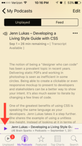
This touch target is directly above the app navigation (across the bottom) as well. I can't tell you how many times I tapped the "unplayed" item instead of the play button. See the irony here? I wouldn't have any unplayed podcasts if I was actually able to tap the play button with ease! Sheesh! End rant.
No comments.