September 14, 2017Comments are off for this post.

Primary Navigation

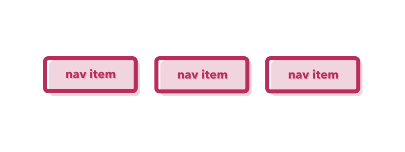
Word: Primary Navigation

Definition: Directing links on a website or application that (most typically) appear above the fold, are displayed near the top of the page, and represent the content that is most relevant to the user.

Thoughts: Primary navigation can usually be found at the very top of a page and is always displayed prominently. Navigation is key to way-finding and acts as a constant and comforting presence to orient the user.

Question: Is primary navigation a left-over relic of internet-past? What will be the role of primary navigation on our infinite and parallax scrolling future?

September 14, 2017Comments are off for this post.

Breadcrumbs

Word: Breadcrumbs

Definition: A type of secondary navigation used for wayfinding, orientation, and location within an application or website. Breadcrumbs prove to be especially helpful when landing on a page out of context or not arriving initially through a homepage.

Thought: Breadcrumbs are seen and used most often on large-scale website full of copious amounts of information, like e-commerce sites. This navigational is growing increasingly important because fewer people enter a website through the front door (i.e. the home page or landing page). In the age of powerful search engines, your user will likely come in through the back. It's very important that when your user arrives, she can orient herself immediately.

September 12, 2017Comments are off for this post.

Skeuomorphic Design

Word: Skeuomorphic Design

Definition: The design style in which old and familiar ideas are incorporated into new technologies even if the familiar no longer plays a functional role. In other words, the digital is made to look like the old (in this case, the physical world) it represents.

Reference: Think of the early Apple iOS design in which the "Notepad" app physically looked like a ruler-lined notebook. Or my personal favorite, the first Southwest Airlines site that was designed to look and function just like the real world ticket counter. (Oh, how far we have come in the world of airline websites.

Thoughts: We have long moved passed the "amateur" skeuomorphism of the internet past and into the world full of flat and material design. Like fashion, I still wonder if we ever see the day when skeuomorphism is so old, it's new again?

September 7, 2017Comments are off for this post.

Hick’s Law

Word:  Hick's Law

Definition: The time it takes for a person to make a decision increases with the number of choices available.

Reference: The law is named for British psychologist William Edmund Hick. Countless studies in fields from psychology to marketing have investigated the effect of options on decision making and satisfaction (I suggest the jam study if you're looking for a good example). Widespread consensus shows that not only do fewer choices decrease the time of decision making (a la Mr. Hick) but it also generates greater user satisfaction. The fewer the choices, the more satisfied the user is with her final decision. Seems counter intuitive, but science doesn't lie, my friend.

Thoughts: While it is simple to see how Hick's Law is used in web design to justify menu and navigation decisions, you would be limiting yourself greatly if that is the only design feature influenced by this principle. If you dig more deeply, you will see that decisions are the crux of experiences and impact every move and click a user takes.

September 3, 2017Comments are off for this post.

F-Pattern

Word:  F-Pattern

Definition: The natural eye movement by Western societies when scanning content rich web pages. Most people will automatically scan the top of a page, then skim down the left-hand side and make a few occasional forays into the center.

Reference: The pattern appears during eye tracking sessions that use heat maps to track a user's gaze. This word is best described with a picture so here's one!

It is important to keep the F-Pattern in mind while laying out a page because this will ensure that the most important UI elements will easily and quickly be seen by your users.

September 3, 2017Comments are off for this post.

Call To Action

Word:  Call To Action

Definition: An interface element (usually in the form of a button, link, etc) that aims to prompt or encourage a user to perform a particular activity

Thought: The Call To Action should be displayed prominently to guide the user, focus the site, and measure success. Word of warning, less is more! Don't render your perfectly crafted Call To Action useless by offering too many actionable options. Be precise and determined in your placement. You should not take this topic lightly; take action instead!

August 31, 2017Comments are off for this post.

Slippy UX

Definition: When a product is designed for "glance-ability", delivering a service or helping to solve a problem by purposefully staying in the background or discreetly out of the way.

Reference: Coined by Jake Zukowski, Assistant Creative Director at Frog Design, the term was used to describe the design of a digital automobile screen. The opposite of "sticky ux", slippy ux is intended to be invisible-enough and non-distracting. As a result, the design does not attract unwanted or unsafe attention.

Thoughts/Questions: As UX designers we are taught to make designs sticky and desirable -- how does slippy UX change the way we approach contextual interfaces? Will this change our over-arching thought process and innate goals?

August 31, 2017Comments are off for this post.

Signifier

Word: Signifier

Definition: A signal that communicates appropriate behavior to a person and where an action should take place.

Reference: Don Norman explains the subtle difference between signifiers and affordances in his book, "The Design of Everyday Things". He amended the book in later editions because while the design community took fondly to the term affordance, Norman believed it was being improperly used (based on his definition).

Thoughts: Touch screens afford to touch... but as to where and how to touch, this is a signifier. 

August 28, 2017Comments are off for this post.

Affordance

Word: Affordance

Definition: The properties of an object that determine what actions are possible. For sake of an everyday example (no pun intended, Mr. Norman), a hinged door affords pushing or pulling.

Reference: The term was originally invented by the psychologist J. J. Gibson to refer to physical possibilities by properties of an object and was famously (in our design world bubble at least) articulated by Don Norman in his game changing book "The Design of Everyday Things." Norman thoughtfully writes,

"An affordance is a relationship between the properties of an object  and the capabilities of the agent that determine just how that object could possibly be used."

Thoughts: Take note, affordances are all around you! But don't get this confused with signifiers.

August 28, 2017Comments are off for this post.

Hamburger Menu

Word: Hamburger Menu

Definition: The three stacked horizontal lines, usually appearing in the top left- or right-hand corner of a website or application, which can be clicked to reveal further navigation and page options. Sometimes referred to as the "pancake stack".

Reference: The hamburger menu was created by Norm Cox for Xerox Star, a very early graphical user interface.

Thought: The icon has become ubiquitous but a continued industry debate has sparked over the past years regarding the icon's effectiveness. While I understand the viewpoint of team "minimalist design", I believe that the deliciously-named icon limits discoverability and should be used cautiously and purposefully.